

Make the embeddable widgets feel at home on your website, by customizing their color scheme, text, trigger and more. You can customize and preview the look and feel of the widgets from Control.
How To Customize The Look And Feel Of The Embeddable Widgets
- Go to Control → Integrations → EMBEDDABLE WIDGET Customization.
- Configure the settings on this page to match your branding guidelines (see below for a more detailed explanation of each setting).
- Save your changes, and you’re good to go.
Click to see the settings you can configure:
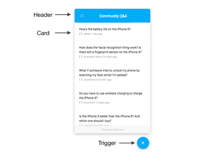
General Settings:
- Community URL: Define where the icon in the top left corner of the header links to (e.g. your community’s URL).
- Position: Choose whether you want the conversational widget (and its trigger) to appear on the left or right side of the page.
Trigger Settings:
- Trigger Type: Choose whether you want to use the ‘button’ trigger (displays on the side), or the ‘floating’ button trigger (floats just above the bottom of the screen).
- Trigger Text: Define the text to display on the button (this only applies to the ‘button’ trigger).
- Trigger Color: Set the color of the text/icon used inside the trigger.
- Trigger Background Color: Set the background color of the trigger.
Header Settings:
- Header Title: Define the text to display at the top of the conversational widget.
- Header Background Color: Define the background color of the panel at the top of the Conversational widget.
- Header Color: Define the color of the header title
- Header Shadow: Enable/disable a drop shadow under the panel at the top of the Conversational widget (disable this for a ‘flat’ design).
Card Settings (shared with the in-page widget):
- Card Title Text Color: Define the color of the text of the topic title.
- Card Avatar Border: Define the shape of the avatar shown for each topic in the list (the last active user).
- Card Metadata Color: Define the color of topic metadata text (the relative time since the last reply).
- Card Border Color: Define the color of the border between cards in the topic list.
Hit the ‘Preview’ button at any time to check your changes and make sure the widget still looks fabulous.
The color settings for the widgets are completely independent from your community color settings (Control → Customization → Colors).
The in-page widget shares the same style configuration as the conversational widget (using the 'Card Settings' described above).
Finished customizing the look and feel of the widgets and ready to take the next step? Check out how to install the widgets on your website:
- How To Install The Conversational Widget On Your Website
- How To Install The In-page Widget On Your Website


