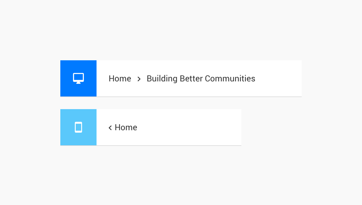
Breadcrumbs
We’ve added breadcrumbs to the community template. Breadcrumbs tell the user where he is within the community domain and allows him to quickly navigate back to a higher level. On mobile viewports the breadcrumb exists of a direct link back to your community homepage.
Improvements

- Filter on new posts (control): It is now possible to filter on ‘New posts’ in the Control Environment, one of the ideas from the ideation category that we implemented
- Change featured topic colors: You can now change the background- and text color for featured topics, this was requested by various moderators after the release of the featured topics
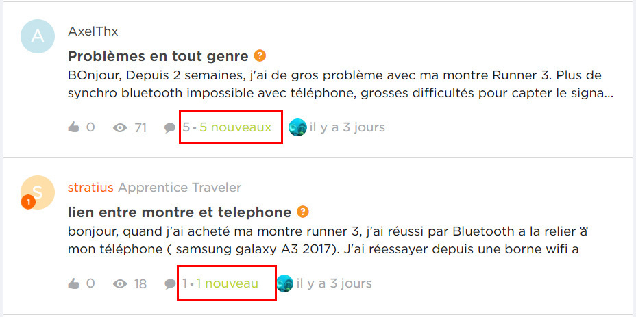
- Plural support for ‘new’ label: The label that indicates how many new topics or new replies there are in a category/topic now supports plural phrases which is required for some languages.
- Updated member statistic: We have made a change in the statistics widget; it only includes registered members now, and not banned users or users in the waiting for email confirmation stage.
Fixed

- Emoji in topic title: Using emoji in topic titles should no longer create issues to your topic
- Surveys: Resolved an issue where in some usecases it was not possible to add a survey
- UI Fixes: several (small) fixes in the interface have been made, mainly on alignment and position
We value your feedback. If you have ideas or suggestions for improvements let us know in the comments below