

The homepage is the central market place of your community. Your experienced community veterans pass them just as first-time visitors. It’s also what most users have in mind when they think about the community. The better the homepage experience, the more likely users will come back in the future. In this article you will learn some of the best practices when customizing your own community homepage.
General recommendations
There are some general things which you should always have in mind when you are changing something on your homepage.
Focus
Never forget what the ultimate goals of your community are and how you can support this via your homepage. Where are users coming from mostly, and what are they expecting to find when the click on a link to your homepage? Of course the focus differs much between community goals (and also: maturity), but here are some examples:
- A support community should focus on providing solutions quickly, but also motivate users to share and answer questions amongst themselves.
- An ideation-based community should focus on clear categorization, highlighting of processes and reviews.
- A customer success community might want to focus on best practices, sharing product announcements, feedback, ideation, tutorials and FAQ content.
- Organizations might want to focus on highlighting the mission of a community as well as highlight user-generated discussions and editorial content.
Tone of voice / choice of words
Speak the language of your customer as much as possible - the goal is to offer your customer a great experience while browsing. Don’t use too official language, you might even want to use the first-person view for buttons or titles (e.g. “I have a question”).
Target your key audience
Always keep in mind which groups of users you’d like to speak to, and where. Some items might be in a better place outside of the community homepage (e.g. onboarding content in a “welcome”-notification).
Monitor changes
Regularly measure what’s working and what could be improved. Review if your ambitions to change something on your homepage actually achieved the result you were hoping for.
Tip: Did you know that we are forwarding all clicks on the homepage directly to your Google Analytics? If not, check out Sending click events to Google Analytics.
Community & Knowlege base categorization
A good navigation makes the difference on every community. If your users don’t know where to go to on your homepage already, they are much less likely to come back (or even start to search).
We will not go too much into detail in this article which categories you should use and how to name them. If you are interested in that, please check the info box at the end. In this article, we will talk about where to put the categories and how they should be displayed.
The location
Always present a clear list of your community categories. New users need that - they are usually looking for information and don’t want to invest too much time in searching where to go. Usually the first categories should be visible as soon as the homepage has loaded. B2C communities should focus on the mobile experience here, while customers visiting B2B communities are more leaning towards desktop viewports (read: more space!).
Usually the best practice here is to have the community categories below a number of highlighted content (read more on this below) or below the knowledge base categories (if applicable). This way your users will quickly find something to work with (as they hopefully know which category their information will sit in) and will not leave immediately due to feeling lost.
When your community is more mature and has many (parent-)categories, you might want to adjust a little and present a list of parent categories. You could display this underneath your banner, on top of featured content or a knowledge base, to guide new users to the parent category homepage of their choice. You can find an example of a use of this list on our inSpired homepage. This way users will click their way to the category that they are interested in more quickly, delivering a positive experience. A nice side-effect of this is that your parent category pages will get more visits, and there they might discover content from all categories within that parent category. Think about a user looking for a support-related answer about a product, but then also sees an interesting (new) product review, or a guide on how to get the most out of that product. This will again stimulate re-visits as users make unexpected positive experience with your community.
In case you are using knowledge base categories, make sure to display them at the top, closely underneath the banner or following a quick link widget. Your users are happier if they directly find their info and do not have to click through community Q&A category lists or use the search.
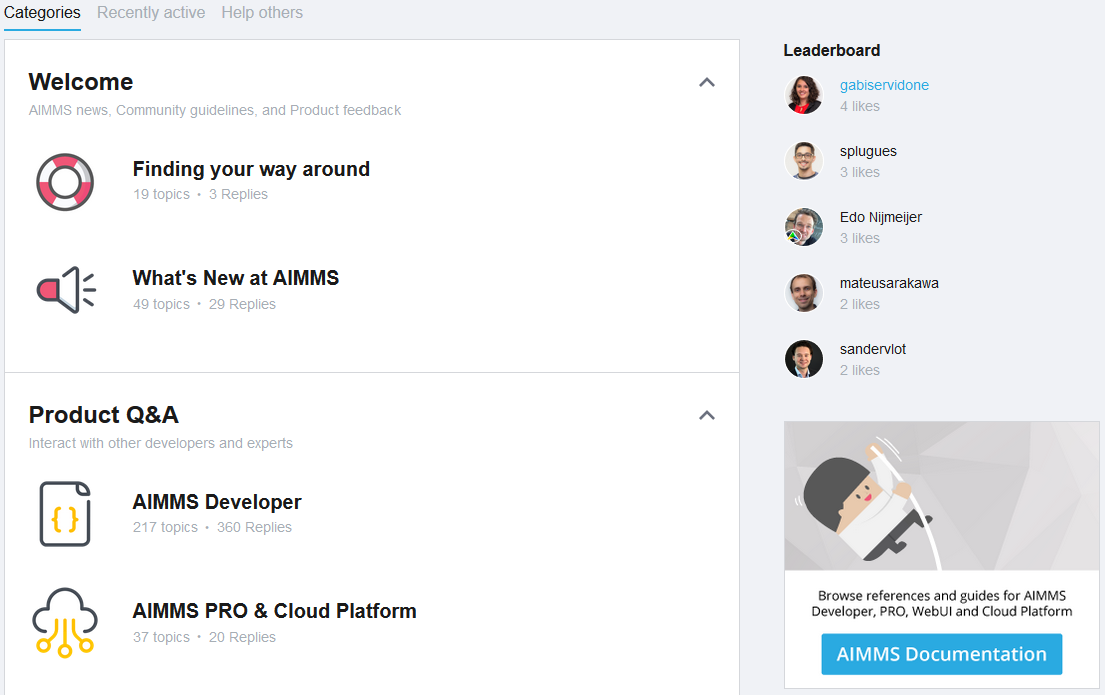
Community category layout
Depending on how big your list of community categories is, think about which community category widget you want to use. A small to medium size community works perfectly with a regular list of community categories within a 2:1 box on the homepage (community category list left, sidebar widgets on the right).
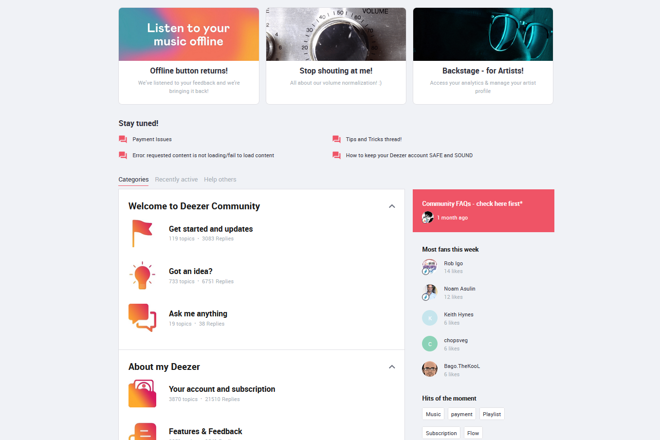
Category 2:1 box on the Deezer homepage
Tip: If your community has many categories within each parent category, you might want to have the list of community categories collapsed by default. Check this tutorial on how to do this.
Community tabs
Sometimes you might not even want to show the list of categories first, but rather want to show a recently active topics, or a list of unanswered questions. You can change the order of the tabs easily.
A practice some communities are very successful with is showing recently active topics first - especially when a community homepage starts with a widget that links to the most relevant (Parent-)categories. Our inSpired homepage is an example of that.
Another use case where communities display the recently active tab is a mature community focussed more on showcasing recent engagement. This is not recommended for communities that recently started as less than min. 5 activities a day will make the community not look active.
Further reading:
- For your new community, you can read here how to build your community categorization.
- For a review of your community categories, check out this tutorial.
- Learn more about knowledge base categories in this FAQ.
Highlighting content
An absolute must on every community homepage is the highlighted content. Without it your homepage will look bland and not interesting. Again, your community goal is determining which content you want to highlight (and in which way).
Quicklinks
The multi-tool of all communities, quicklinks will empower you to guide your users anywhere you want them to be. Think outside of the box: Which 2-6 pages are the most relevant most of your users are looking for? Can you point them also to pages outside of the community that might benefit most of the users visiting?
Here are four different use cases and examples:
- External pages: Link to the “contact us” page, a status page, product documentation pages, an external knowledge base, the “my-environment”
- Category pages: Link to your top 3 (parent-)categories
- Content pages: Link to (Community) Onboarding FAQs, Ideation category, Top viewed support FAQ, Community guidelines, Troubleshooting guides
- Call-to action/Activation: Ask your question, Share your idea, Meet the Super users
The main goal should be to offer the top things visitors are looking for, but don’t overload your users with too many options neither. Ideally you display 2-6 quicklinks that are giving a clear indication what to find after the click.
Tip: You can easily change the layout of the quicklinks in the customization mode
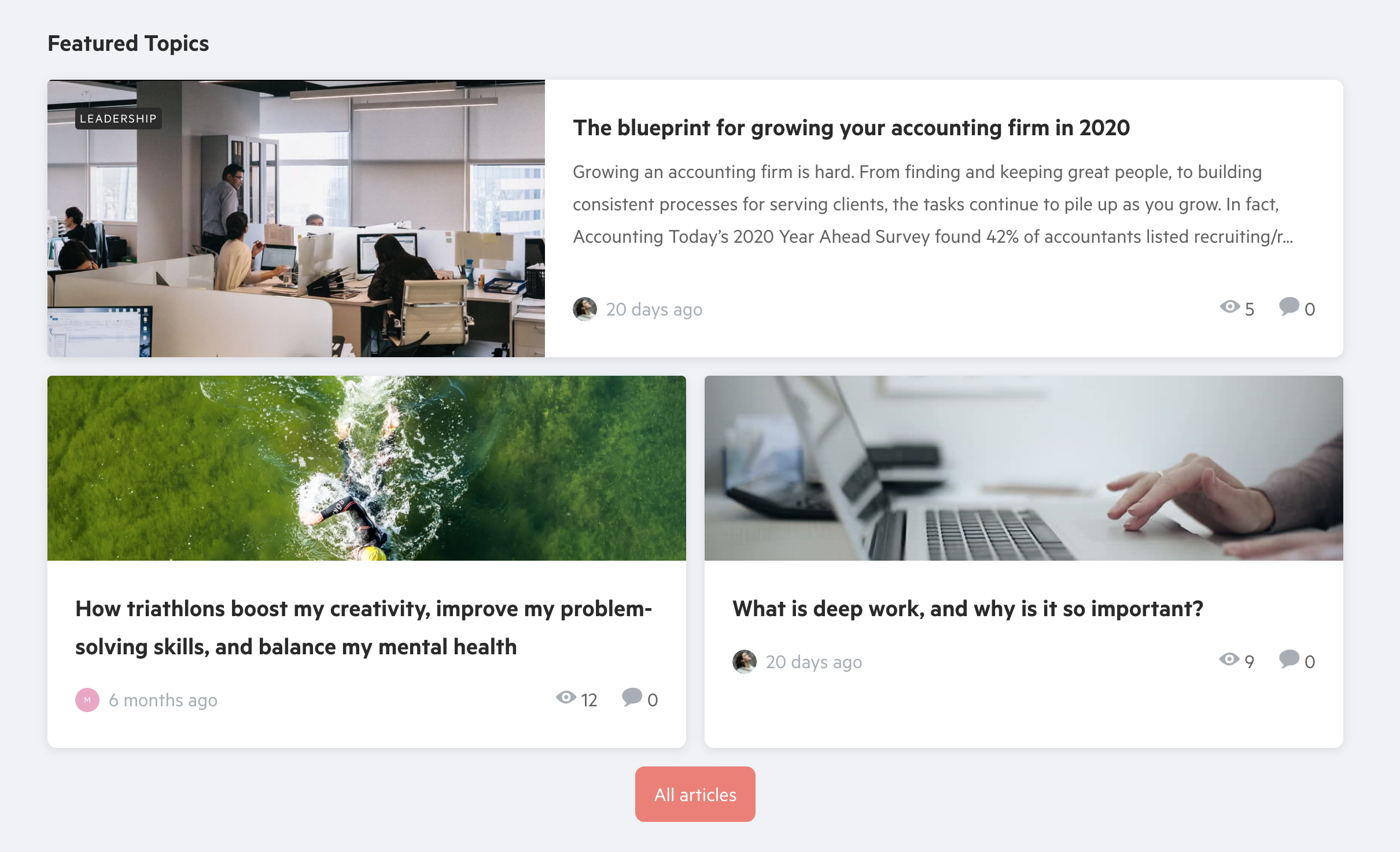
Featured topics
Featuring topics is just as important as using our quicklinks. There are three different types of content you want to highlight here:
- Evergreen content is the content that many users are looking for - that FAQ on how to reset a device or how to port a phone number.
- News content that you want your users to know about - a product announcement, general service content, an event that’s coming up
- Strategically placed content is content that the user is not necessarily directly looking for - a guide on best practices, “engagement”-content, blogs or other editorial content
Note: We now actually have two different versions of featured topics on our homepage: the classic version (added via moderator tag featured_homepage) as well as the new way to feature topics (via customization mode). We advise to use the customization mode, as this is easier to manage and offers you more options.
Traditionally, most communities use a mix of these types of content (due to the classic way of featuring topics). However there are new opportunities which are also able to support dedicated use cases better, in case you want to focus on one of these types of content here.
The o2 community higlights editorial content which is serving more entertainment-purposes than the traditional support or FAQ content. This can help if your strategy is to focus more on user activation and user experience:
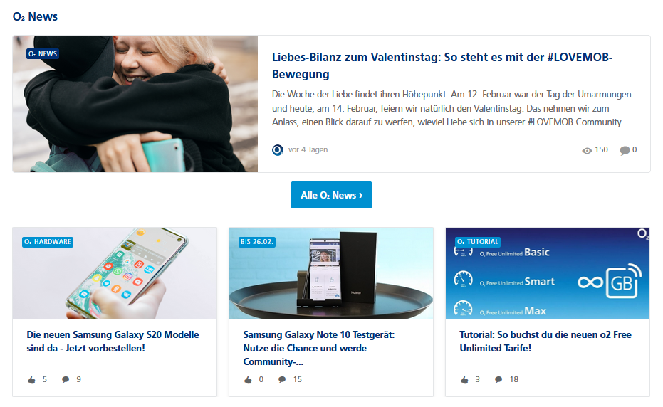
Featured topics on the o2 community
You can still use a mix of different types of content, in case you want highlighted content to serve different purposes. One way to approach this: focus on the most relevant / viewed / discussed topics of the week or month:
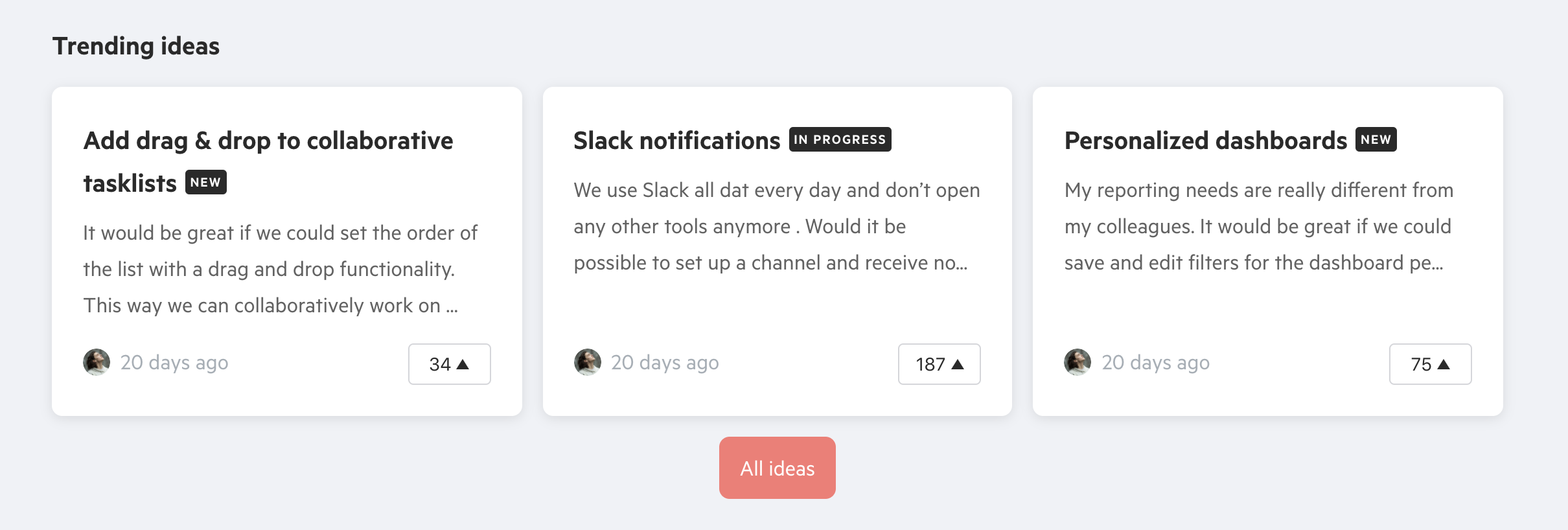
When focusing on co-creation and building better products with your community you may want to highlight new or trending ideas:
In the near future, we will focus on a more personalized homepage experience. This will enable you to give different content to different user groups. So make sure to stay tuned on this to learn how you can serve user-specific content via featured topics!
Recommended content
Different to featured topics, recommended content does not come with a large tile nor a preview image. If the content you want to put on your homepage does not include a hero image (like Q&A, ideas or discussion topics), you are best to highlight the content via this feature. This widget is usually located right above the list of categories - it will be the last thing a user sees before he/she starts browsing through the list of categories.
It usually is being used for support content, but it can also include smaller announcements your users might not be aware of. The best practice here is to display 4 or 6 pieces of content as an even number of content displays nicely in this location.
HTML widget
Just like quicklinks, the html widget is very flexible. You can either locate this widget in the sidebar, or put it inbetween e.g. your banner and your community category list. Fill it up with a bit of code to give your community a very personal touch!
Sidebar widgets
Widgets in the sidebar are usually being used to promote content & to activate your users. Mostly images are used, but if you feel creative you can also think about adding gifs, videos or a social media feed.
Sidebar widget on the AIMMS community
There are much more use cases than this however. You can also use the HTML widget here to promote a newsletter that you are sending:
Sidebar widget on the Infoland community
Homepage widget
You can now also add the html widget between different items on your homepage. Think about a second banner with a clear call-to-action between the knowledge base and the community category list, or a small animation that promotes your community culture. Or add a banner to the bottom of the homepage to address users who did make it to the bottom of the page, and offer them more content or ask them to start a discussion. Again imagery will help to improve the user experience here.
Sidebar widgets
Next to the HTML widget, you should also incorporate a number of sidebar widgets on the homepage. Please make sure to offer a different experience than on category pages or topic pages, as the homepage is serving a wider audience and is your opportunity to show off what your entire community is about.
Location
The order of your homepage sidebar widgets is important, think about which things you want to highlight first. Widgets located at the bottom of the sidebar will not get as much exposure as the ones located at the top of the list.
Featured topics
A best practice adopted by almost all communities is to have this widget sitting at the top of the list. This is important as you might have relevant content (e.g. information about current issues) that you want to highlight here for a short amount of time. If you want to know more about this feature, check this FAQ.
Note: If there is no content that is featured in the sidebar, the widget will not be displayed.
Leaderboards & Activity streams
Most communities use gamification widgets on their homepage. The main reason is activation. You want to show that your community is active and that there are experts with reputation. This motivates your Super users to stay on top of the hall of fame as well as stimulates other users to be active. Such a widget is usually second or third in the list, after the featured topics widget and (optionally) the HTML widget.
Which widget you will use (point-based leaderboard, like leaderboard, Badge activity stream) is up to your choice. However more communities are adopting the new point-based leaderboard as it is regarded as the most powerful. This does not have to be exclusive, often this is being used together with the Badge activity stream further down below.
Tag cloud
A tag cloud is used mostly by more mature communities and not very often by starting communities. The reason is that at the beginning of a new community, there is not a lot of content that is tagged. So if a user would click on one of these tags, they would only see a small number of topics, causing a poor experience.
Answered questions
It is a good idea to use the answered questions widget when you are running a support community. It will show visitors that users are finding help on the community and this will make it more likely that visitors register and start asking their question as well. Usually this is located above or below the tag cloud and does not sit at the top of the list of sidebar widgets.
Examples of good homepage implementations
Here’s a list of community homepages that we enjoy surfing


 If you look closely, you will see that also on the