

This one's for all you button fanatics out there. What should your buttons look like and how should they respond to mouseovers and clicks? The power is in your hands.
How To Change The Design Of Buttons
- Sign in to a community account with user role Community Manager or Administrator
- Click the purple Theme button and select Buttons
- Configure the basic settings that apply for all buttons:
- Border radius
- Border width
- Font weight
- Text styling (lowercase or uppercase)
- Find the button you want to change and click the title to reveal its settings
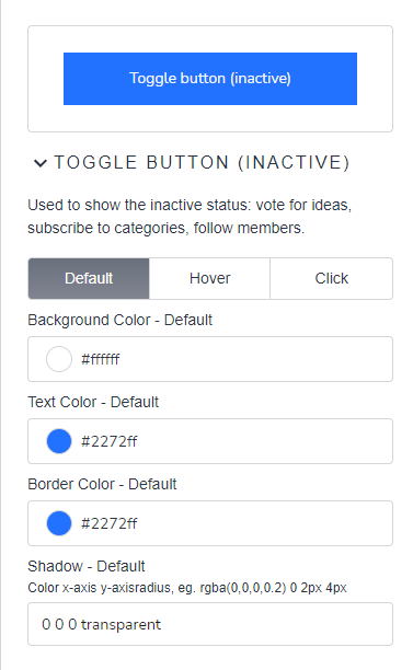
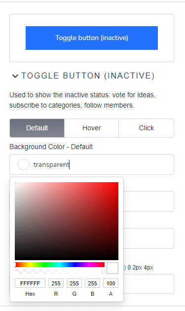
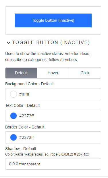
- Click Default, Hover, Click to select which button state you want to configure
- For background, text and border color provide color in HEX or RGBa format; use ‘
transparent’ if you want to have a transparent background. - For button shadow provide an RGBa code, x-axis, y-axis, and radius, leave empty if you don’t want a shadow.
- For background, text and border color provide color in HEX or RGBa format; use ‘
- Click Publish
Note:
- When you make changes you will get a live preview directly in the Buttons mode and in the page.
- The toggle button consists of 2 states: inactive and active. Don’t use the same styling for both states.
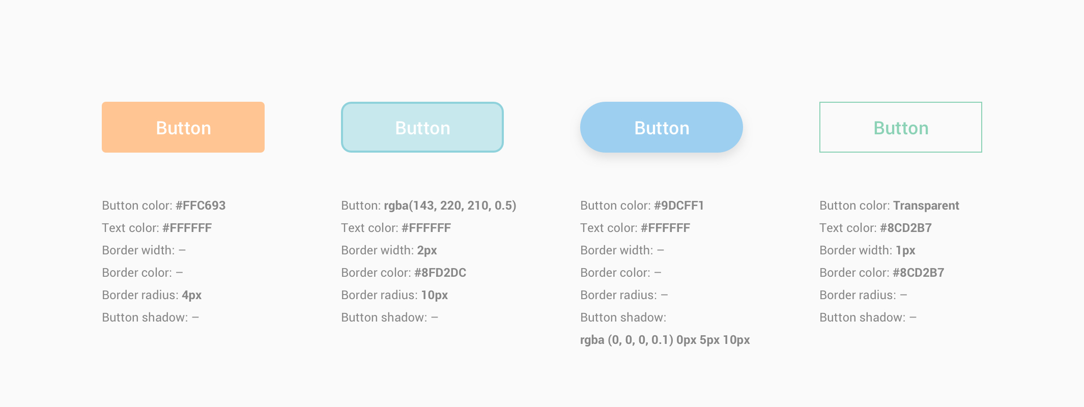
Tip: Set Button color to ‘Transparent’ and Border width to at least ‘1px’ to create outline buttons. See the 4th button in the image above.
Button examples: