


It has been on our wishlist for a long time to be able to share valuable benchmark information with you here on inSpired. In the past, this was not an easy task simply because it was not that easy to collect all this information for you in an efficient manner. While we performed a benchmark last year, the process was quite labor-intensive and not scalable. Hence we are super-proud to say that we are now able to offer you these insights on a more regular basis!
Before we dive into the numbers however, let’s first have a quick overview what we measured, and how.
Scope and methodology
This benchmark has a focus on all the B2C communities which use inSided. We further categorized communities based on vertical (Telco & Consumer online services) and also on their level of maturity (more on that later).
We have measured only communities that have been live for at least six months in January 2021. It is important to note that, in a small amount oif cases, we were not able to measure all KPIs for each community, mostly due to missing Google Analytics integration.
What KPIs have been benchmarked?
Here you can find an overview of each KPI that we benchmarked. Further below you can also learn where to find the data to measure these yourself!
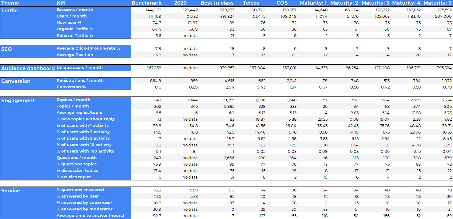
| Traffic | Engagement | Service |
|---|---|---|
| Sessions | Registrations | Questions / month |
| Users (visitors) | Conversion (% of new visitors that register) | % Questions |
| New user % | % of users with 1 activity | % Conversations |
| Organic Traffic % | % of users with 3 activities | % Articles |
| Referral Traffic % | % of users with 5 activities | Average time to answer |
| Click-Through-rate % | % of users with 10 activities | % Questions answered |
| Unique users (Audience Dashboard) | % of users with 100 activities | % answered by peer |
| Replies / month | % answered by Superuser | |
| Topics / month | % answered by Moderator | |
| Average replies / topic | Average time to answer | |
| % user topic without a reply |
Missing anything?
Are you missing any KPIs in this overview that you’d like us to benchmark? Sometimes we lack rich data on some subjects (e.g. exit survey data), but if you have a question or suggestion, just let us know in the comments!
The findings
Here you can find the results, broken down per theme and KPI. Next to vertical-specific benchmarks for Telco and Consumer online services (COS), you will also find benchmarks based on community maturity. But how did we define maturity, and under which maturity level does your community fall under? We have written a short definition for each level below. To learn the maturity level categorization of your community, your CSM will be happy to help you further!
Which maturity does my community fall under?
For a general indication, here what we see as indicators for the different maturity levels:
Maturity level 1
These communities either are younger than 12 months, or are for other reasons not yet making use of their full potential (e.g. lack of ressources, strategy or reach).
Maturity level 2
These communities have been live for at least a year, show decent activity, but the overall reach and activity is still relatively small compared to the benchmark and the potential (given their customer base).
Maturity level 3
These communities are mastering their goals (mostly service) quite well, have an active group of Superusers and are now starting to discover more use cases that go beyond their initial business case.
Maturity level 4
These communities have been active for at least three years, and show higher levels of activity (with a larger group of seasoned Superusers). At least one other use case (next to service) has been adopted well by the community users.
Maturity level 5
These are the oldest and also most active communities on our platform, they have been live for at least five years and have 6-digit figure total registered users. Well-defined processes, a larger group of Superusers as well as advanced integrations
What are the differences compared to the 2020 benchmark?
Needless to say, 2020 was quite a special year. Especially our Telco customers had to handle store closings, support teams working from home, as well as new kind of questions that have never been handled on the community before. This had a huge impact on the benchmark. Mostly in Q2 of 2020, especially companies with physical stores had challenges to deal with the increased demand for online support. This impact partially transitioned well into 2021 for some communities as well.
In general, we now see more stable numbers than last year, where the performance was fluctuating much more heavily on a monthly basis. This is due to the COVID situation slowly normalizing across the EU and the US.
Engagement
In general, we see a small downtrend across most engagement KPIs, which is likely also related to the phase of the COVID pandemic that most countries find themselves in in 2021. In average, there is a 10% decrease in registrations and posts. We interpret this as a sign that there is less pressure on visitors to register than in 2020, where many new questions arised that have never been handled on the community before.
Traffic & Reach
In terms of reach, we observe an increase in sessions and visitors. In a normal year, you can also expect this, simply as each community is growing in content and therefore also the relevance & SEO power is increasing. The organic traffic however seems to show a small decrease. We did not compare the total numbers here, so it could also be that more users find the community via e.g. links on the company homepage (pushing down the relative share of organic traffic).
Service value
Looking at the service KPIs, there seems to be a downtrend of the share of questions that have been marked as answered. This KPI is crucial not just because it shows how many users had their question answered, but it is also very important as it helps other visitors to find their answer more easily and can bee seen as an indirect driver of organic traffic.
We see a chance that this KPI performs higher because of the nature of the questions: Less questions are being asked about COVID-related topics, therefore have a higher chance of being answered as they are more standard questions (that also are more likely to be answered by other users).
How does my community perform against the benchmark?
Usually, we cover some of this benchmark data during our business reviews with you. But if you cannot wait until then, you can of course do your own calculation to compare your community with the benchmark. Here an overview of where to find the data for the respective KPIs:
| Traffic | Engagement | Service |
|---|---|---|
| Google Analytics Search Console Audience Dashboard | inSided Dashboards User export Post export Mark as answer export | Success Dashboard Mark as answer export Content Dashboard |
Here’s a tip
In general, we advise to measure monthly activity for at least 6 months and then calculate the average values. Also, make sure to spot peaks and, if necessary, take them out of the calculation.
Should you have questions about the specific calculation of a KPI, simply let us know in the comments!


