Status Quo
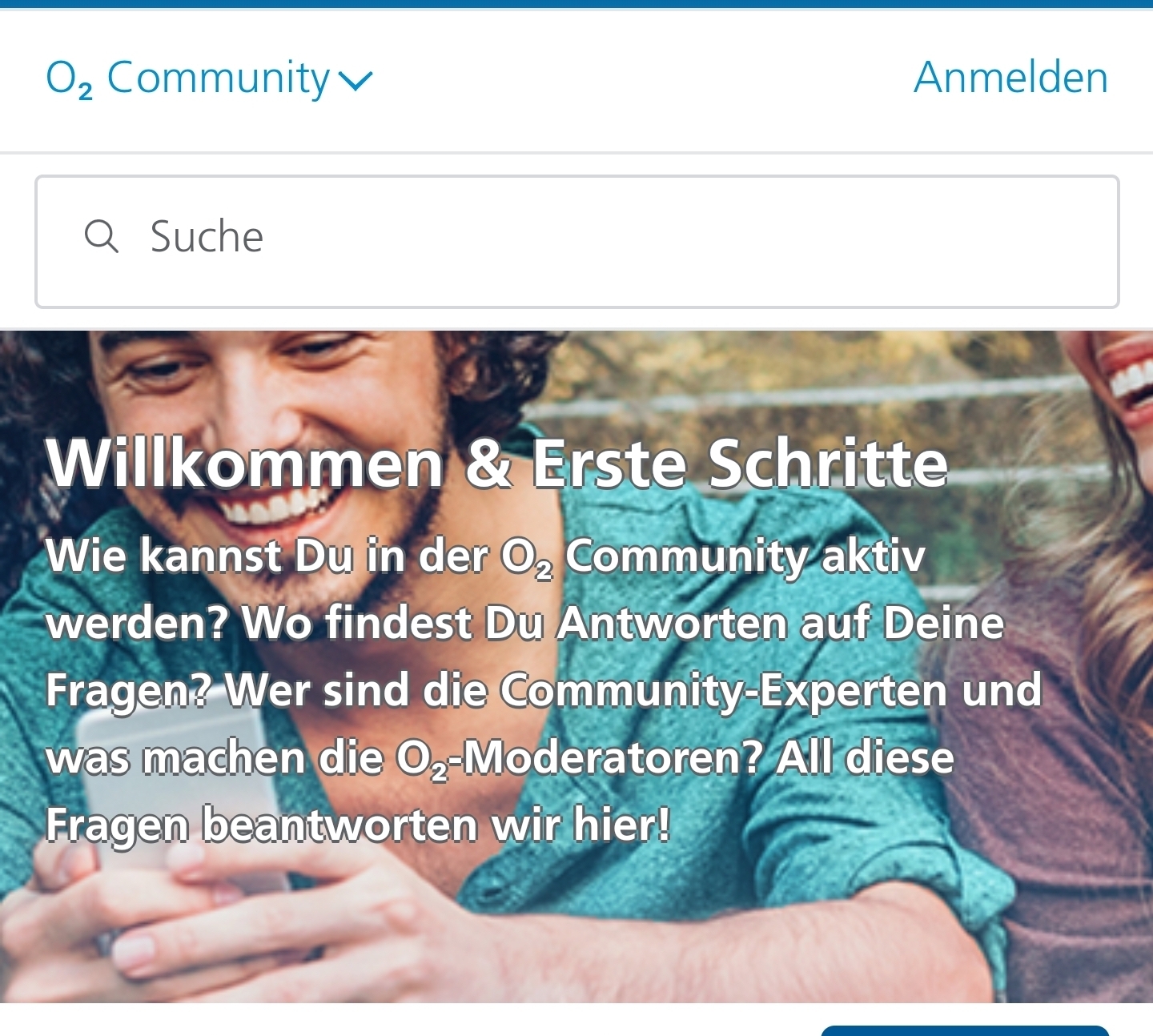
When viewing any inSided Community on a desktop, the homepage’s brand hero image and the subforums’ hero images are displayed exactly like an administrator has uploaded and saved it. When viewing the Community on a smartphone, these images are scaled and cropped to fit the viewport of the device, as well as automatically focussed to the center of the image.(Currently there is a discrepancy in the behaviour. The homepage’s brand hero image is focussed to the left and the subforums’ hero images are focussed to the center. I already created a ticket for that.)
The issue
Not every hero image still looks good after it was automatically focussed to the center. Some images might look better when the focus is more to the left or to the right. Every image or graphic is composed differently and the most important / relevant part isn't always in the center..And as more than 60% of all users visit our community on a mobile device - and most likely the numbers on your community are similar -, less and less users get to see the full desktop version of the hero images. So while the current solution is targeted to have an optimal output on desktop, most users won’t get an optimal viewing experience.
Desktop version:
The image is displayed as it was uploaded to the control panel.
Smartphone version:
The image is scaled, cropped and focussed to the center.
The idea
I want to propose an enhancement to the current upload functionality of the "Edit forum" page in the Control Panel ("Forum Settings" -> "Forum Structure" -> "Edit"). Under "Subforum Image" I would like to see an option to customize the focus of the uploaded image when it is scaled and cropped for smaller screens.Option A (simple solution):
We get to choose one of three focus options (e.g. from a drop-down list):- left
- center
- right
Option B (preferred solution):
We can set a focal point directly on the image: A function is implemented that lets an administrator specify a targeted area of the image that should always be the mid point (focal point) of the hero image, no matter the screen size.That way it would be ensured that hero images not only look as intended on the desktop, but every administrator also has full control over the output for mobile users, which make up for the majority of the community visits.


Bump.
Awesome idea! I would be so helpful if we have more option concerning adjusting the hero image.
I spend too much time tweaking an image, to make sure it looks good on all devices.
It’s totally understood that developers will opt for one particular functionality, but I’ve had a very long conversation today trying to explain that what’s happening with out banner images isn’t a bug, but a design decision that’s simply causing far too much pain. This idea would allow for true mobile optimization in a far more user friendly way. Given that overriding and/or tweaking pre-written CSS AND trying to account for different devices through media queries isn’t always simple, I’d love to see the customization of banners allow for this type of decision making. Great idea! Upvoting and looking forward to seeing if this is picked up.
Up we go. Any news here?