
Wanted to share some thoughts on the mega menu and see how others are thinking about it and finding it working in their communities:
- curious as to the reason the mega menus don’t appear on hover and require a click -- the pattern you generally see with these kinds of menus is one that exposes the content in the menu first on hover, allows for the main navigation element to be clicked taking you to an overview, or child elements within to be selected to get to specifics
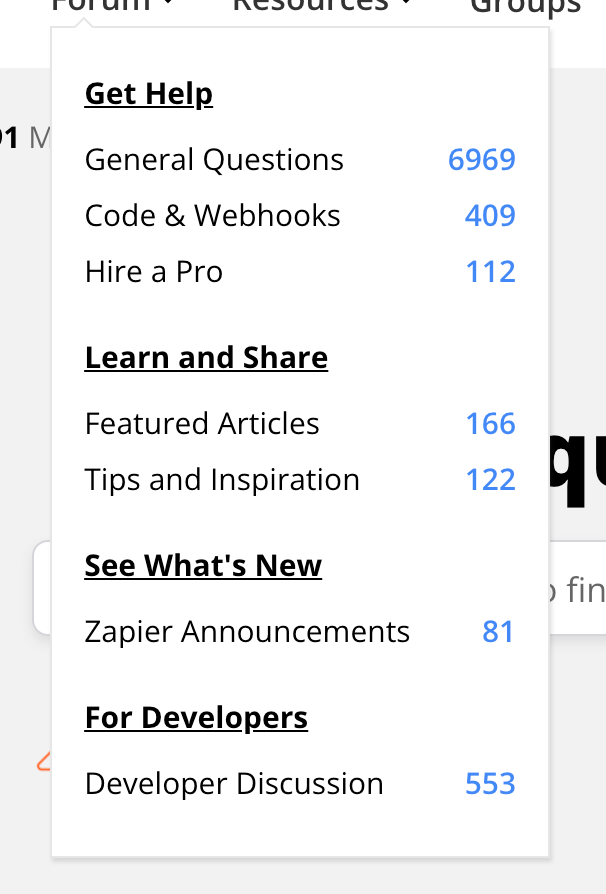
- for menus - has there been any discussion about tightening up the relationship between the parent and child? Seems like there’s a lot of white space and a better relationship to the parent that could be created. I see the crew at Zapier has done a bit of work here via custom CSS to better distinguish the hierarchy of information:
- for the community menu - it’s not always clear that there may be more parent/child categories in the menu - wondering if a change in width or some other indicators would help here
- with the new KB menu - it seems duplicative to have the primary nav item and the item at the top of the menu be the same -- seems like this could be accomplished by having the main item be clickable as noted above
@Marion Frecaut @Ati Somos

