

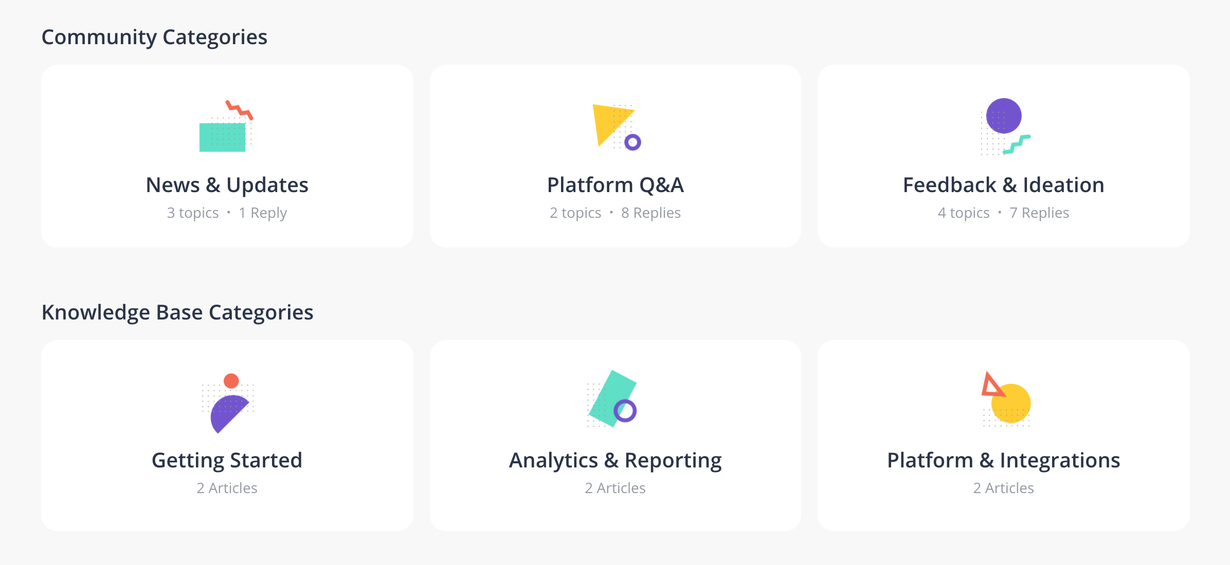
Cards are powerful UI elements that bundle important information together and allows the user to quickly scan and navigate the pages of your platform. The Card element is common in the inSided platform and used for the following:
-
Quick links
-
Community category cards
-
Knowledge base category card
-
Category cards on parent category
-
Featured topics
How To Change The Design of Card Elements
- Sign in to a community account with user role Community Manager or Administrator
- Click the purple Theme button and select Cards
- Configure the basic settings that apply for all cards:
- Border radius
- Border width
- Click Default, Hover, Click to select which card state you want to configure
- For background, text and border color provide a color in HEX or RGBa format; Decrease the opacity slider all the way to ‘0’ if you want to have a transparent background.
- For button shadow provide an RGBa code, x-axis, y-axis, and radius, leave empty if you don’t want a shadow.
- Click Publish
Note: Card elements will inherit the title, text and border color configured in “Colors” by default. If you wish to set a custom color for any of these elements you’ll need to uncheck the “Use X color” checkbox below the input field.