
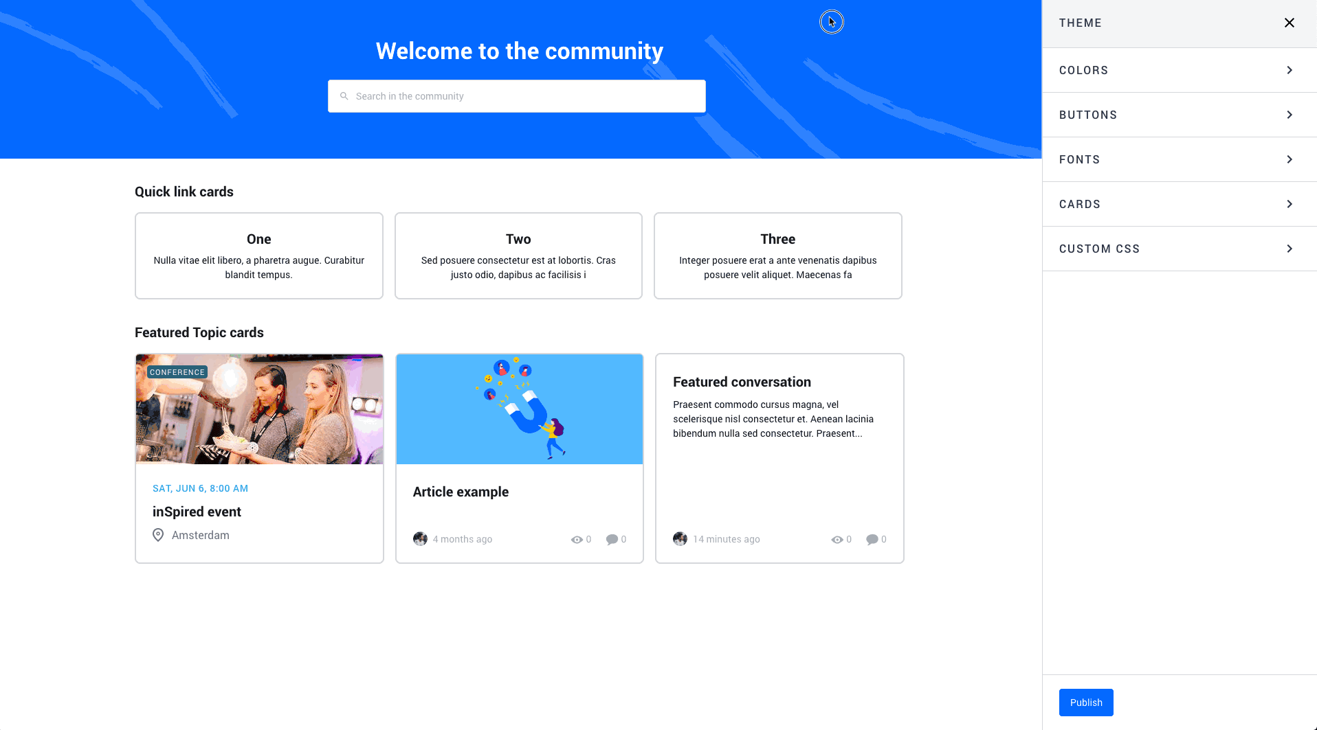
We’re taking the ‘Customization’ mode one step further and will soon introduce a new ‘Theme’ configuration mode.
In this mode you can configure generic styles that are applied consistent with your entire platform, such as colors, buttons, fonts, card- and list styling and Custom CSS changes.
What to expect
- Theme configuration: A whole new mode in the community to allow you to easily change generic styles. You won’t need the Control environment to make changes anymore!
- Color configuration: Manage, edit and preview your color scheme
- Button configuration: Manage, edit and preview your buttons and their behaviour for various interaction states (default, hover, click)
- Font configuration: Manage, edit and preview your font-families
- Card configuration: Manage, edit and preview the look and feel of cards (used for quick-links, categories, featured topics etc) and their behaviour for various interaction states (default, hover, click). This has an impact on your existing card design:
‘Cards’ are used everywhere in the platform:
• Quicklinks
• Featured topics
• New featured topics
• Events overview
• Knowledge base widget
• Category widgetCurrently the styling (title, text, border-radius, border-width, box-shadow etc.) of cards is not the same for all cards. We will align all cards elements and make sure they look and feel the same.
- Custom CSS: Write custom CSS styling and directly preview the changes you wrote
- Blazing fast live-preview! Changes that you make can directly be previewed in the homepage. No more jumping back- and forth between Control and your Community layout.
When will the ‘Theme’ mode be available?
You can expect the Theme mode to be launched later this April. We’ll inform you here via inSpired once it’s there.